Rarely do we receive so many questions, so many comments and demands over an upcoming review. In the few days since our HTC Touch HD unboxing and hands-on video demo, the messages have been flooding in. Today, we’ll try to answer those questions – and, of course, the biggest question of them all: have HTC managed the unthinkable and tugged the must-have crown from the head of the iPhone 3G? In the first half of our two-part review, we’ll be looking at the touchscreen, OS, GUI and keyboard entry, as well as the Touch HD’s internet abilities and more.
For first-impressions we’ll point you at our unboxing post. We’re still waiting to hear back exactly what will and will not be included in the retail packaging. Someone at HTC has obviously given no small amount of thought to the perceived quality of what’s included – the USB cable, for instance, is finished with a soft-touch, rubberized coating; a small point, perhaps, but you notice it – but I wish they’d given equal thought to the AC adapter. A universal design, with slot-in country-specific pin sections, with a UK plug it protrudes down from the socket not up and, as such, if your power point is in a low skirting-board, it won’t fit. Just as with the USB cable, it’s a small point but, yes, you notice it.
Put a 3.8-inch 480 x 800 display into your smartphone and you’re making a statement; you’re also taking on some impressive competition. The iPhone 3G is just one of HTC’s key rivals with the Touch HD; there’s also RIM’s BlackBerry Storm, the Sony Ericsson XPERIA X1 and the Samsung Omnia i900. Each has their advantages, certainly, but with the exception of the Storm – which we’re yet to spend time with in person – the Touch HD bests them all. Picture the crispness of the HTC Touch Diamond’s screen, stretched to take up the fullness of this new, broader sibling; image quality is something we’ll not tire of.
It’s that fact which makes the resistive touchscreen all the more frustrating. Like with the rest of its Windows Mobile range, HTC have selected a standard, non-capacitive touch panel; the benefit is that it responds both to the stylus and to a finger, making it suitable for both general prodding and the sort of handwriting input we’re told the Asian markets prefer. The downside is that, while good for a resistive screen, it feels less precise and responsive than the display on, say, the iPhone. A slightly-flexible plastic front is necessary, rather than glass, and the fact that it responds to finger pressure means scrolling isn’t as smooth as on the Apple handset.
Nonetheless, it’s certainly no slouch. For once HTC’s custom Windows Mobile GUI, TouchFLO 3D, has room to really spread out. The bottom tab icons are large and finger-sized, and swiping from side to side quickly flicks through the panes. Everything has been spread out, some aspects more successfully than others. The weather pane, for instance, now incorporates both the large day’s forecast with the next four days along the bottom, rather than on different pages; however on the main home pane the clock has become oversized and squandered space that could have been used to display more calendar entries. Only three will fit without scrolling, just one more compared to the Touch Diamond’s 1-inch smaller display.
Still, there’s more customization on offer, with the new found ability to remove and reorder the different panes (although the home tab is locked in place and you can’t switch it, the settings or the program launcher panes off). A new Stocks display has been included, too. It makes it all the more disappointing when you drop out of TouchFLO 3D and into standard Windows Mobile, which is pretty much a given unless you’re only making calls and taking photos. Microsoft’s smartphone OS might support high-resolution displays, but it certainly doesn’t take advantage of them: font options are basically large & clunky or small & stylus-demanding, with none of the finesse seen on rival OSes. Contrast any of the standard settings pages with HTC’s communications manager, and tell us which you’d prefer to have more of. This isn’t HTC’s fault, as such, but it undoubtedly takes away from the user experience; Windows Mobile 7 can’t come soon enough, frankly.

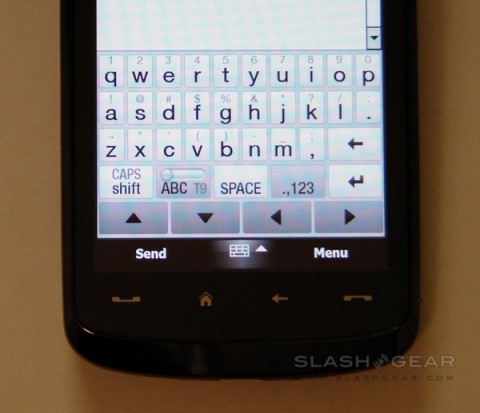
Happily touched upon by HTC’s GUI finessing is the on-screen keyboard. In addition to the usual Windows Mobile QWERTY, ‘block recognizer’ (similar to Palm’s old Graffiti system), ‘letter recognizer’ (which accepts handwriting letter-by-letter) and ‘Transcriber’ (which accepts full-screen, whole word handwriting), there are three of HTC’s own keyboards. Phone offers a standard numeric keypad for either multi-tap or T9 entry; Compact QWERTY is similar to the BlackBerry SureType system, with two letters per key and T9 used to decipher which you intend; Full QWERTY gives the whole keyboard. Each has a straightforward switch to toggle T9 on and off, together with several pages of characters. The video at the bottom of this page demonstrates all the available options.
The HTC full QWERTY offers keys the same size as those on the iPhone. Happily the resistive touchscreen is precise and responsive enough to differentiate well enough to make typing at a reasonable speed possible. Two factors, though, keep the iPhone input method ahead: first, and most simple for HTC to change, is the way the iPhone letters ‘pop up’ when you press them. Typing on the Touch HD with the stylus is no problem, as the keys are big enough to still see which you’re tapping; with a finger, however, the whole button (and most of those surrounding it) is blocked.
Second, and more frustrating, is the poor auto-correction. Here the iPhone is leagues ahead of Windows Mobile, managing to make sense out of even the most haphazard of typing styles. On the Touch HD, meanwhile, simple things such as “I’m†– where you’d like to miss out the apostrophe, have it automatically added, and the ‘I’ captitalized – aren’t recognized. It’s not a deal breaker, certainly, but it slows you down.
The messaging app is the usual Windows Mobile 6.1 fare, with Microsoft Exchange compatibility for push email (along with wireless calendar and contacts synchronization). Giving Microsoft their due, setup of an Exchange account is always straightforward on WM handsets; email and password was all it took to get everything up and running. POP3, IMAP and Hotmail are all relatively easy to set up too, but push email does initially confuse by having on- and off-peak delivery frequency switched on by default. The handset assumes that, out of office hours, you’re content to get new email every thirty minutes rather than as soon as it arrives; that may be so, but with no suggestion that it’s set up that way it can lead to initial confusion.
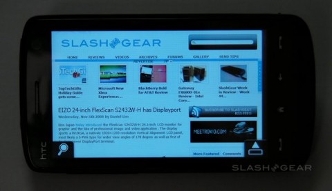
Thankfully HTC preinstall Opera Mobile 9.5 (build 2682 on our review sample). Unlike the mobile version of Internet Explorer, Opera Mobile supports tabs; however out of the box it only permits three at a time and there’s no obvious way in the normal settings menu to change that. Instead, go to “opera:config†in the address bar and there’s an option to increase the number. That tweak made, it’s a very usable browser; zooming – in the absence of multitouch – is triggered either by double tapping on a section of the page, or by calling up a zoom scroll-bar by tapping the icon in the bottom left corner. Panning around the page is done by dragging with your finger or the stylus.

It’s not perfect, though. The zoom seems less “intelligent†than that on Mobile Safari, for instance, which automatically reframes around different sections of the page. On the Touch HD it instead zooms in by a specific amount, and then requires you to tweak the level and shuffle the page about to fit in exactly what you want to read. We also have an ongoing issue with selecting links: it almost seems as if the Touch HD’s high-resolution screen is better than Opera’s designers ever expected it to be. When viewing a whole webpage we can see the links, we can even tap on them individually (with the stylus, at least), but the browser won’t actually register the tap unless you zoom in closer. It’s an ongoing frustration and adds an extra step into browsing.
We look at GPS performance, the media functionality of the smartphone – including the camera, audio and video – and battery life. We also explore how the Touch HD performs as a phone. You can find Part Two of the exclusive SlashGear HTC Touch HD review here.
loading...
loading...
