 After long testing the new Interface, Google is now Live with the new 3 column interface.
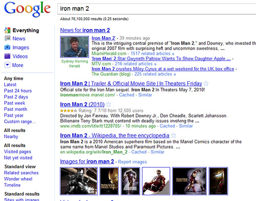
Google has added contextually relevant, left-hand navigation to the page. This new side panel highlights the most relevant search tools and refinements for your query. The new design refreshes and streamlines the look, feel and functionality of Google, making it easier to pinpoint what you’re looking for. It’s simple yet elegant.
Universal Search helps you find the most relevant types of results for your search. The top section of the new left-hand panel builds on Universal Search by suggesting the most relevant genres of results for your query and letting you seamlessly switch to these different types of results. The “Everything” option remains our essential search experience with different types of results integrated into the main results, but now you can also easily switch to just the particular type of results you are looking for.
Things definitely look alot more cleaner and snappier. The tree column interface looks inspired by Bing, but still is unique in its own ways.
You can use Google Squared (available on Google Labs) to find and compare searches. You can easily explore not only the results for your current query but other related topics.
More about the design, in the video:
How to get New Google Look N Feel UI
Google is rolling out the new look starting today, and says it expects most English-speaking users will see it by the end of the week. You can try it now by visiting Google.com/ncr (U.S. Version)
We write latest and greatest in Google, Firefox, Chrome, Tech Guides, Apple, iPhone, Tablets, Android,Open Source, Latest in Tech, subscribe to us @taranfx on Twitter OR:
loading...
loading...


The new UI design is really very cool…
loading...
loading...
The new UI design is really very cool.
loading...
loading...