![]() Google is now eleven and a half years old, but it has never changed it’s look drastically. For Google what matter s the most is simplicity. Keeping the simplicity still simple, google is all set to to revamp it’s search UI.
Google is now eleven and a half years old, but it has never changed it’s look drastically. For Google what matter s the most is simplicity. Keeping the simplicity still simple, google is all set to to revamp it’s search UI.
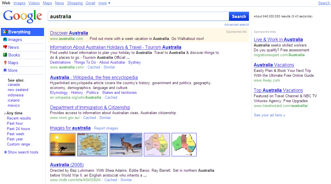
This is how the new Google home page will look: (click to enlarge)
Search Modes
Let’s take a closer look at the changes. Here’s an overview of the new results page in testing:
“We’re basically looking at a new look and feel for Google, It’s an overall cleaning up of the search results page.” said Google
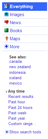
The search options appear in the left-hand column. The former “All results” area that allowed you to switch between different types of searches (images, news, maps and so on) has been replaced with new tabs for these services:
Internally, Mayer said that Google calls “modes.” For example, after searching for “australia” in the example above, you’re in “Everything” mode. But with a click on the Images tab, you can switch to “image mode” and get back image results, select News to get news results in “news mode” so on.
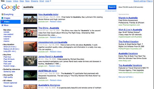
By default, Google guesses at the modes it thinks are most relevant to your search. But the “More” tab gives you access to the full range of search services Google offers. If you Video mode, and that’s not automatically suggested, you can select More, choose Video and get those results:
As happens now, when you switch modes, the search options change. In video mode, you get unique video filtering options such as duration of clip or to see only video in high quality:
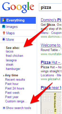
What’s more is the new area “See also”. This section suggests other queries related to your original topic.
Google 3Pane
The most dramatic change in the design is that the search options window is permanently open, rather having to be manually toggled on, as is the case now. That’s right. If the test proves successful, Google’s almost certainly moving to a three “pane” format, with search tools and options located on the left, search results themselves in the middle and ads on the right.
Mayer said going left made the most sense. Google continues to add new search features, and they need to be exposed to searchers somewhere. Putting them at the top of the page pushes results down; ads are already at the right. Having the tools on the left, with the pane permanently opened, is something she said she’s personally wanted for some time, but not everyone in the design team was convinced. The test will be a final proof of how well it works with Google’s audience.
“While I wish we had gotten here sooner, I’m excited to finally have it out.”
Mayer added that Google had recently done nearly 50 mockups, all done independently, to examine results. A three pane design was a common theme that kept coming up. That made it final.
So what do you think about the new Design? Is it intuitive?
a WordPress rating system
a WordPress rating system


this surely looks like google following bing 😀
a WordPress rating system
a WordPress rating system
I would agree 🙂 Bing's UI is great but quality of results, there's no match for google
a WordPress rating system
a WordPress rating system
hey this does look kinda nice!
a WordPress rating system
a WordPress rating system
hey this does look kinda nice!
a WordPress rating system
a WordPress rating system
Looks like Bing; Google gives better results for most people, but I like Bing enough that I'll
stick with Bing. I stopped using Google 5 years ago.
a WordPress rating system
a WordPress rating system
This has nothing to do with copying Bing, and everything to do with Google trying to draw user's eyes away from search results and towards ads. This is the only explanation for not offering an option to collapse the sidebar.
http://www.google.com/support/forum/p/Web+Searc…
a WordPress rating system
a WordPress rating system